

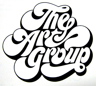
A few months ago, I posted this fantastic hand-drawn logo for THE ART GROUP. Not on some Logo Wars shit, but just on some typographic craftsmanship appreciation.
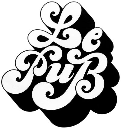
So everything was fine and good within the realm of The Art Group up until yesterday when I stumbled upon this gem, created by French typographer Claude Mediavilla:
As far as I know, these were both created at about the same time.
LET'S GET READY TO RUMBLLLLLLLE

15 comments:
The Art Group.
The Art Group. Easily.
...waiting for Cina to chime in. I showed him both and he was kinda feelin Le Pub.
The larger contrast and tighter letter relations of the art group make it a winner for me. Something bothers me about the overlap cuts in the P and B of le pub. and is it just me or do the e and u of Le Pub looks way too fat compared to the Caps?
The Art Group = Sexy
Le Pub = Cute
The Art Group. For sure. The interplay between characters is really nice. Definitely agree with Jeremy that it is sexier.
Hhhmmm - torn on this one. I think The Art Group one looks a bit squashed and The Pub one definitely has an awkwardness about it, but I'm going to go with the underdog and say, The Pub!
T to H connection!
the art group. The characters in it have more of an awareness of what is going on around. Also, I feel it reads Better.
The Art Group. It has that fluid, fat, flowing look. The other one looks like it was simply typed out and had a way-too-deep shadow applied.
The Art Grizzl.
The Art Group kills it
TAG. Its a sweep!
I squint or think of how these would look as stamps or linocuts...
The Art Group FTW
...the overlapping P and B on le pub=not working.
Art Group, the Le Pub has a little too much going on. The way the letters all kind of curl at the end makes it not smooth. Art Group=Smoooooth
I'm not crazy about either, but I like the balance of black and white in #2. #1 strikes me as congested. My eye can't get cozy with it.
Post a Comment