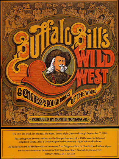
Here's a magazine ad for a rootin'-tootin' cowboy show. I love the chunky, late '70s illustration and typography style used to create an image so clearly "wild west" and how it fits together so effortlessly. There's something about the complexity of typography from the era just before computers came around that hearkens to the turn-of-the-20th century graphic arts. This image is so 1981 and so 1901 at the same time. Thoughts?
 Click for larger view


4 comments:
exactly. design trends (like any trends) are cyclical, and this is a good example. the pseudo-relief woodcut style harkening 1901 with type curves of the 80s is a nice mesh!
whoa so sick
This piece was created in 1972 by a friend of mine here in California. He created some amazing work in the 70' and 80's.
Hey Seth - thanks for the note! Could you pass along his contact info? I'd love to get in touch with him. My email address is mike @ twelvecarpileup . com
Thanks!
Mike
Post a Comment