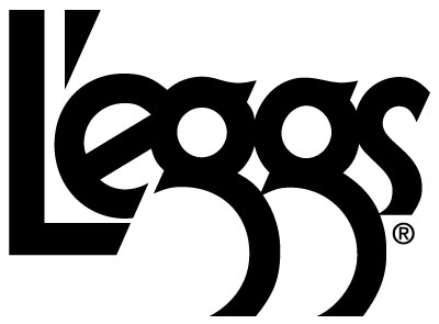
L'Eggs... no contest, slick LE angle and double g. Just way to well thought out, fits together nicely and makes sense. Master Lube
The original "egg" packaging for them was pretty sweet, i guess they just recently switched to cardboard... weak. I couldnt find any great examples of the old packaging to share though sorry.
L'eggs is the obvious pic. The Le slant (plus its match with the cut on the g) is tight for sure. But something about the apostrophe throws me off. I'd be curious to see it shifted to the left just slightly, eliminating the eyesore of a gab between it and the L. That's just me though.
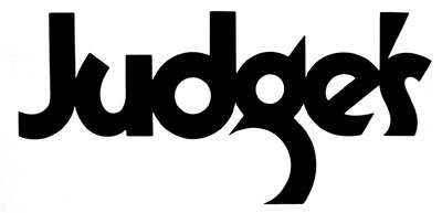
Yeah, the Judge's u is kinda wack. The d almost makes up for it though. Gimme a break, I'm trying to root for the underdog here.


9 comments:
After much deliberation I'm goin with Judge's
L'Eggs... no contest, slick LE angle and double g. Just way to well thought out, fits together nicely and makes sense. Master Lube
The original "egg" packaging for them was pretty sweet, i guess they just recently switched to cardboard... weak. I couldnt find any great examples of the old packaging to share though sorry.
Sam, I need to hear you to make your case for Judge's!
L'Eggs! - no contest for me. The 'u' on Judge's lets it down in my mind.
L'eggs is the obvious pic. The Le slant (plus its match with the cut on the g) is tight for sure. But something about the apostrophe throws me off. I'd be curious to see it shifted to the left just slightly, eliminating the eyesore of a gab between it and the L. That's just me though.
Yeah, the Judge's u is kinda wack. The d almost makes up for it though. Gimme a break, I'm trying to root for the underdog here.
I hope Logo Wars will become a regular feature.
The deciding factor: THE Gs LOOK LIKE LEGS!
I'll try to find more logos to duke it out again! Nice to see you're all into it. Thanks for taking part in Logo Wars!
The Gs look like a firm booty
^^^^^^^
seen
I've always been a fan of Lubalin, but I don't know David Leigh.
L'eggs is the obvious choice. Judge's just seems like an uncomfortable rip-off (or unsuccessful tribute)
Does anyone know anything about Leigh here? Was it meant to be a tribute?
And I vote for this logo wars to become a regular feature as well. Terrific idea.
Post a Comment