
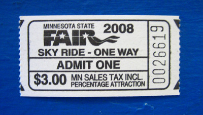
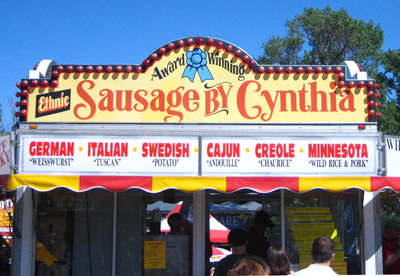
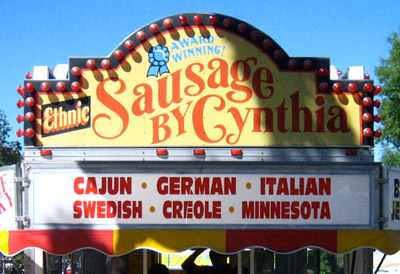
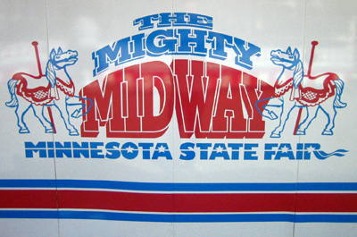
This weekend, I went to the Minnesota State Fair with my friends Joe and Helen. Aside from looking at livestock, comparing prize-winning corncobs, and hunting for the elusive chocolate-covered bacon on a stick (I never found it), I ended up finding a lot of eye-catching and blog-worthy graphics. Visual identity and graphics at the state fair are interesting; since there is such an overwhelming amount of clashing signs, banners, and logos promoting everything from lawncare products to fried cheese curds, there isn't really any one encompassing look or brand to everything (aside from the great late '70s-style state fair logo which is seen throughout the fairgrounds (and on the Skyride ticket above). Because of this visual lawlessness, you see everything from cheap, carelessly-designed foamcore displays suitable for middle school science fairs and gorgeously-crafted, brightly-colored, hand-painted signs. Here is just a slice of some of the great So Much Pileup-worthy visuals found at this year's Minnesota State Fair...
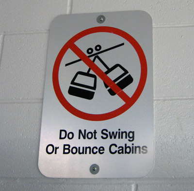
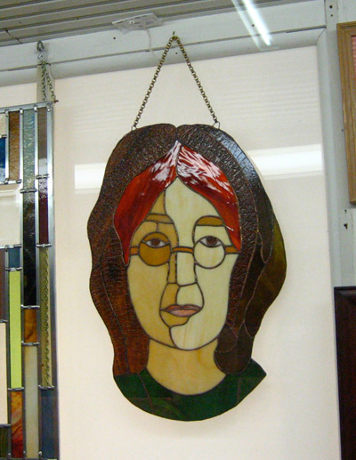

This lady was standing in front of this door forever and I felt weird asking her to move so I could take a picture for my graphic design blog... so I just came back later.
Lulz.
Hipster DJ party flyer.

3 comments:
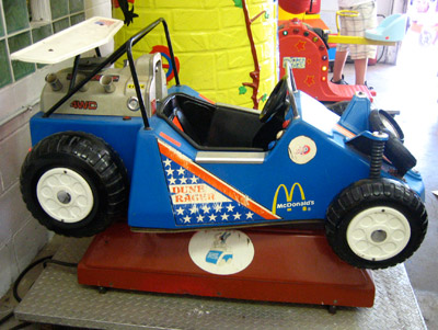
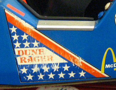
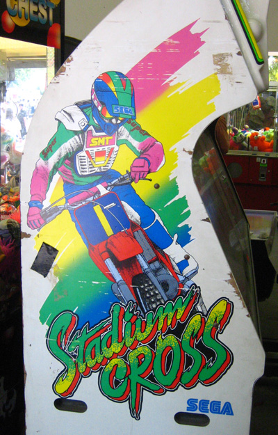
It's all about Stadium Cross and Dune Racer.
It's a major award!
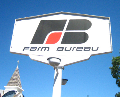
Ah, the Farm Bureau logo. Some things never change. :)
it was at the famous dave's booth, and was actually served in a paper cone, rather than on a stick. Great shots, hey. Really nice.
Post a Comment